Categories
PRODUCT DESIGNER
Mateusz Wojciechowicz
Welcome to my UX/UI section.
- My rulebook
- Project name:
Rulebook + 🧠 The Psychology of Design + UI/UX Design Laws to Optimize Your Process
My goals:
I build products according to certain rules. I have created a figJam files with information that helps me to proceed with the process.
My AI agents:
I build AI agents to support my work.
My portfolio
- DOZ pharmacy
- Project name:
DOZ Apotek.
My goals:
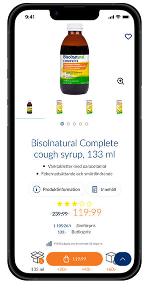
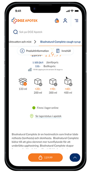
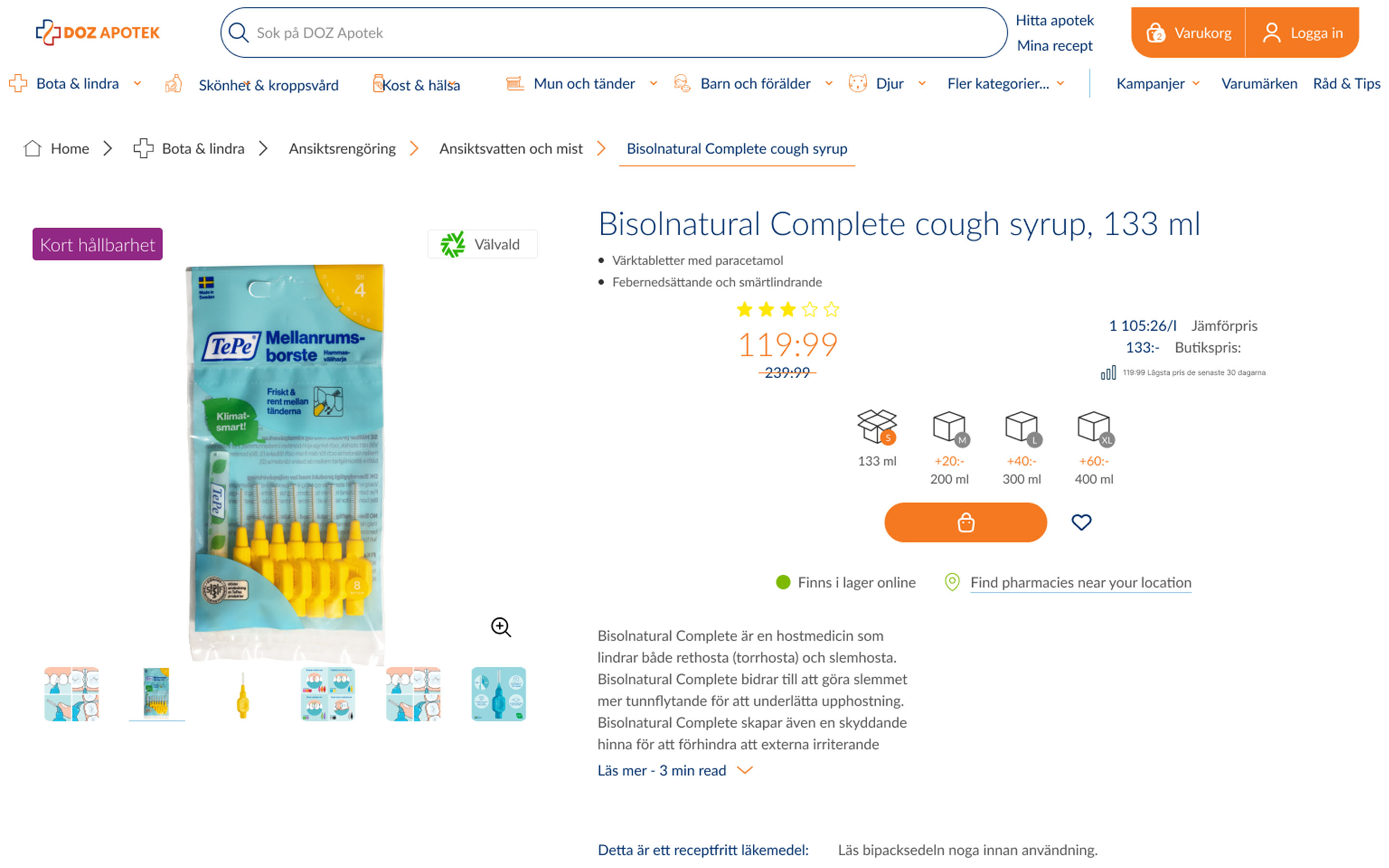
Working with DOZapotek.se, my job was to rebuild the product with a new design and UX approach.
Challenges I faced:
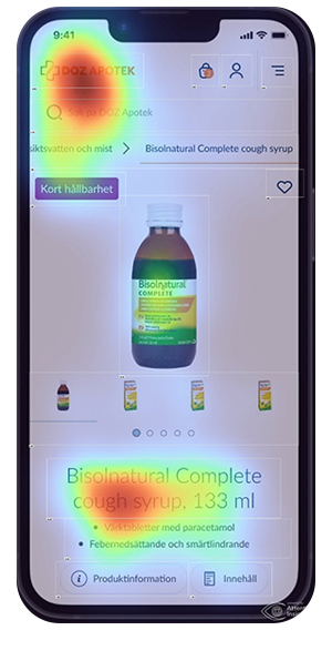
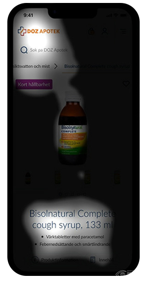
The product owner decided to take small steps with this, so I created milestones for the process. First, I made a new design system with atoms, which I evolved according to the project's needs. The first milestone was to swap the current visuals with the new ones. Next, I created a new UX approach for certain product sections. I finished with an AI analysis to scan the heat maps for layouts and design. I prepared this process to be as transparent as possible to assure the Product Owner of his decisions.
My critical skills:
Jira helped me communicate with the product owner regarding design, UX ideology with prototyping, and AI analysis with heat mapping. I also prepared a "Design introduction" in Figma as a manual on proceeding with further creations. I prepared the library according to the tailwindcss framework guidelines. Everything was built according to the design system I agreed to with the Product Owner and Developers.
My impact on the project:
My new approach changed the User-centered design. The new functions made certain project sections more transparent and easier to use.
There are a few screenshots and prototypes below. Direct link to dozapotek.se
Design Introduction prototype / Design system
Direct link to Design Introduction prototype
Case study / e-commerce
Direct link to case
- Omni Loyalty Club
- Project name:
Omni Loyalty Club.
My goals:
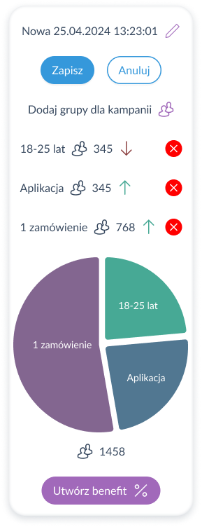
Working with CEPD.tech, my job was to design a product to create and manage campaigns.
Challenges I faced:
I got a sketch of an idea with prospect functions and possibilities. I created a mindmap to visualize this development's potential and challenges.
My critical skills:
A problem solver: I used a combination of logical thinking and predictive analytics to make recommendations that solved problems. This helped me connect the dots.
My impact on the project:
I created a layout that maintained design across all display resolutions and helped reuse code for most aspects of the product. This fact made developers' tasks more manageable and accelerated their work.
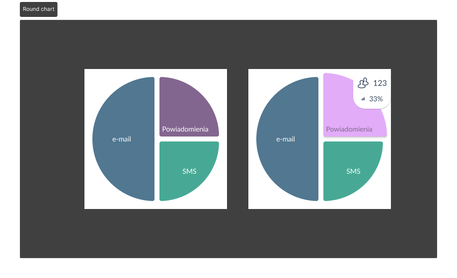
There are a few screenshots and prototypes below.
- Stellar
- Project name:
Stellar
My goals:
Working with CEPD.tech, my job was to design a SaaS product dedicated to two separate companies to manage the warehouse's stock and orders. The project was divided into milestones.
Challenges I faced:
I got a list of user requirement specifications (URS) for every section of the product. According to these documents, I have prepared user flows, low-fidelity wireframes, and UI for every URS. I have created User Experience tests to check clients' pain points and introduce User Interface solutions simultaneously.
My critical skills:
A problem solver: I used a combination of logical thinking and predictive analytics to make recommendations that solved problems. This helped me connect the dots.
Inquisitive: I have a natural curiosity and drive to continue learning and figuring out how things fit together.
A critical thinker: I think critically about which functions are crucial in the first place to help provide desired results.
A visualizer: I visualized functions concisely and accurately, which is easy to digest.
Both detail-oriented and a big-picture thinker: I handled complex functions with an understanding of how my interpretation would affect the product user.
My impact on the project:
I have created User Experience tests to check clients' pain points and introduce User Interface solutions simultaneously.
There are a few screenshots of prototypes below.
Case study / SaaS
Direct link to case
- Nike - GenAI concept
- Project name:
Nike - GenAI concept.
My goals:
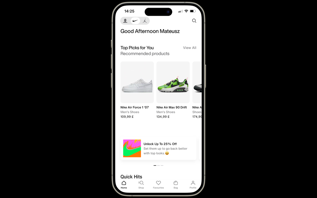
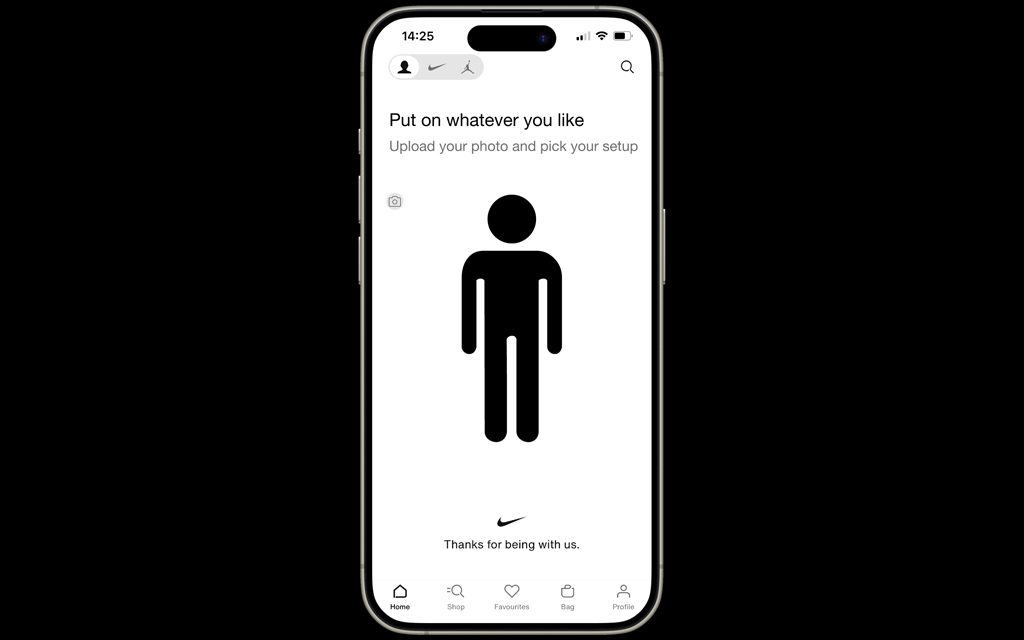
It is a concept for the Nike application to create extra experience for users.
Challenges I faced:
According to current AI possibilities I came up with idea to generate content for the Nike application users.
My critical skills:
The knowledge I got from MITxPro Designing and building AI products and services, helped me to structure the idea to generate content.
My impact on the project:
I prepared a mind map and prototypes to present this idea to the client.
- Zoocial Marketplace
- Project name:
Zoocial marketplace.
My goals:
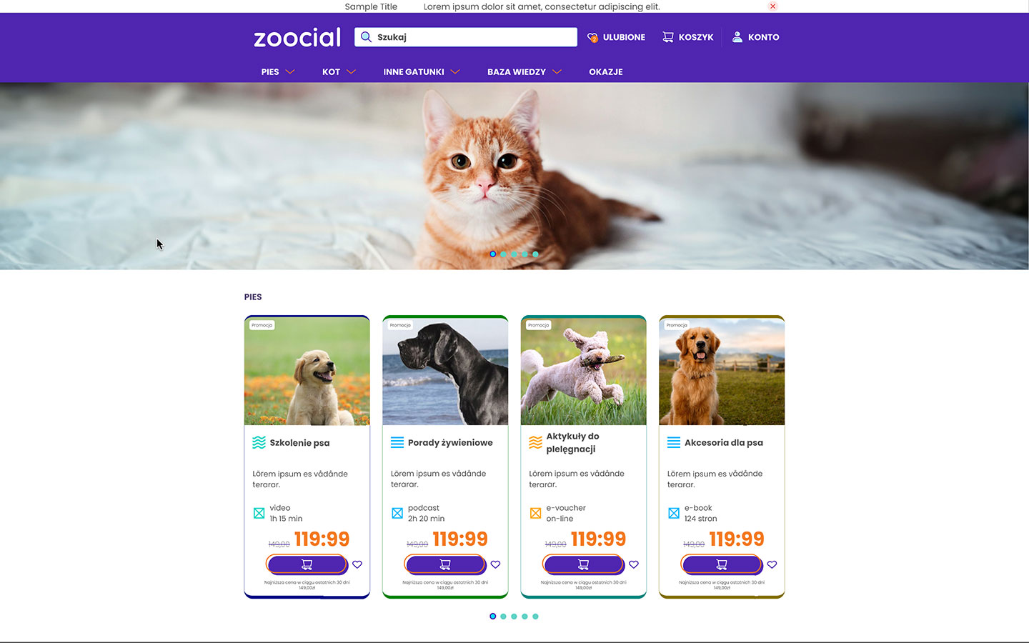
One of my projects working with CEPD.tech was creating an animal care marketplace.
Challenges I faced:
The product owner decided to set a scope for each MVP stage. The client chose to build it with Magento open software.
First, I made a new design system with atoms and settled with the Product Owner. The MVP-0 stage was to follow the Magento layout and change design aesthetics only. I settled with developers on the best way to approach this. The MVP-1 is to fit the new UX approach with an extra option for the admin panel to improve relations with business users.
My critical skills:
The design system had to fit the client's website's aesthetics. It was like reverse engineering action. I had to predict the potential evolution of UI so the design system would smartly evolve.
My impact on the project:
I created components from the beginning so the product owner's extra expectations would be introduced quickly. I led the product owner with future MVPs with potential UX gains or issues.
- Natura Drogeria App
- Project name:
Natura Drogeria App.
My goals:
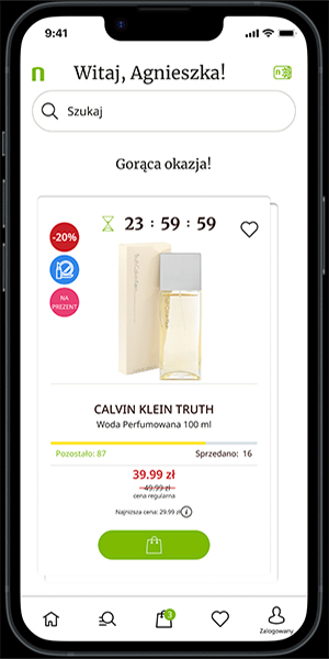
My job at Drogeria Natura was to design an app according to the drogerianatura.pl online shop.
Challenges I faced:
I had to go through tens of meetings to fit the Product Owner's UX expectations and set the design system according to them.
My critical skills:
I prepared a design system according to Flutter standards. The design system, including icons had to fit client's e-commerce aesthetics .
My impact on the project:
From the beginning, I created components, so the next MVP stage would be more accessible with less time needed.
- Natura App with AI features
- Project name:
Natura Drogeria App with AI features.
My goals:
My job at Drogeria Natura was to design an example of the User interface of the app's AI feature.
Challenges I faced:
I had to create a user flow introducing a path showing the potential use of the feature. I used the Figma's prototype plug-in.
My critical skills:
I prepared a design system according to Flutter standards. The design system, including icons had to fit client's e-commerce aesthetics.
My impact on the project:
From the beginning, I created components so the next MVP stage would be more accessible with less time needed.
- Natura Drogeria Blog
- Project name:
Natura Drogeria Blog.
My goals:
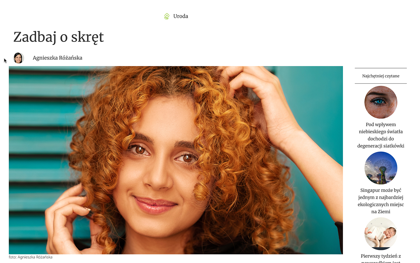
My job at Drogeria Natura was to design a blog for the drogerianatura.pl e-commerce.
Challenges I faced:
I had to go through tens of meetings to fit the Product Owner's UX expectations and set the design system according to the e-commerce that the project was related to.
My critical skills:
I prepared a design system. The design system, including icons had to fit the client's e-commerce aesthetics. It was like reverse engineering action.
My impact on the project:
From the beginning, I created components to quickly introduce the product owner's extra expectations. Direct link to drogerienatura.pl/blog
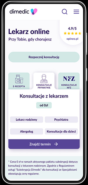
- Dimedic
- Project name:
Dimedic.
My goals:
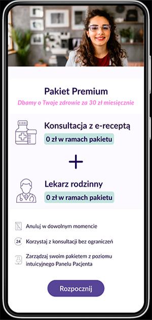
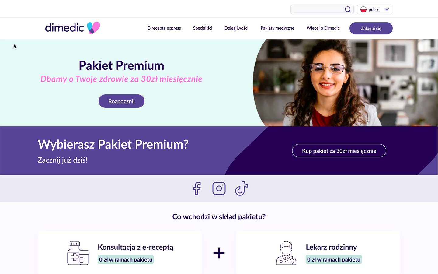
My job at Dimedic was to design extra features for the product.
Challenges I faced:
I had to create a user flow introducing a UX path and the path's prototype.
My critical skills:
I prepared a design system. The design system, including icons, had to fit the client's website’s aesthetics. It was like reverse engineering action.
My impact on the project:
From the beginning, I created components to quickly introduce the product owner's extra expectations. Direct link to dimedic.eu/en
- m-commerce product
- Project name:
m-commerce.
My goals:
One of my projects working with CEPD.tech was to create a concept of a health and medical assistance app.
Challenges I faced:
I had to create a user flow of any possible UX path and the path's prototype.
My critical skills:
I prepared a design system to consist of the logic of the creations that proceed. I attended many brainstorming meetings to invent the product's best possible features. I sketched a wireframe of potential user experience paths and finished with high-fidelity prototypes.
My impact on the project:
From the beginning, I created components so any other changes would be more accessible with less time needed.
m-commerce structure
Direct link to m-commerce structure
Design brainstorm
Direct link to Design brainstorm
- e-commerce
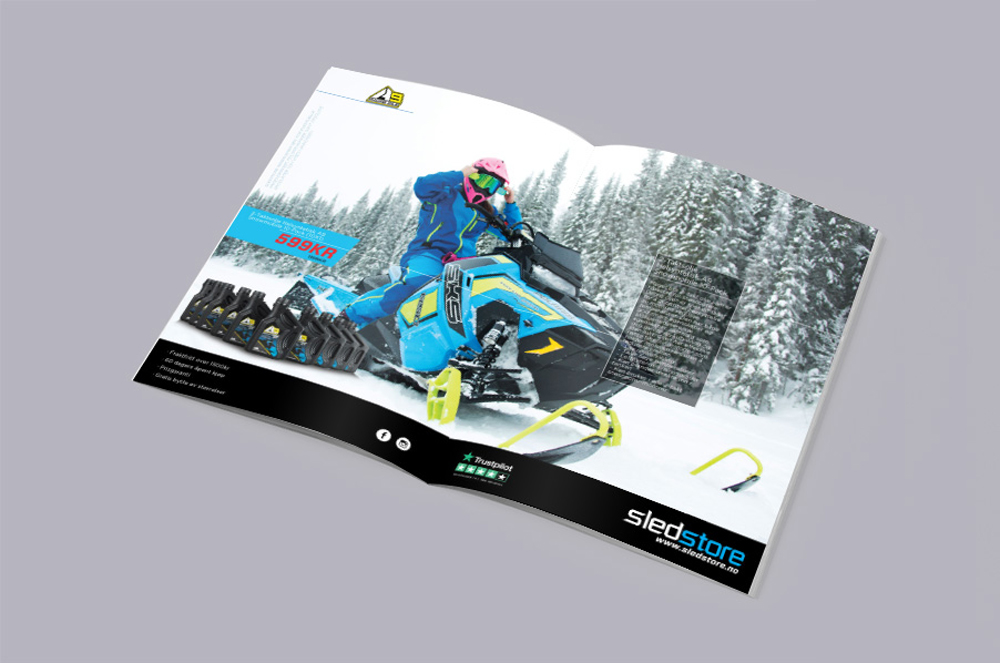
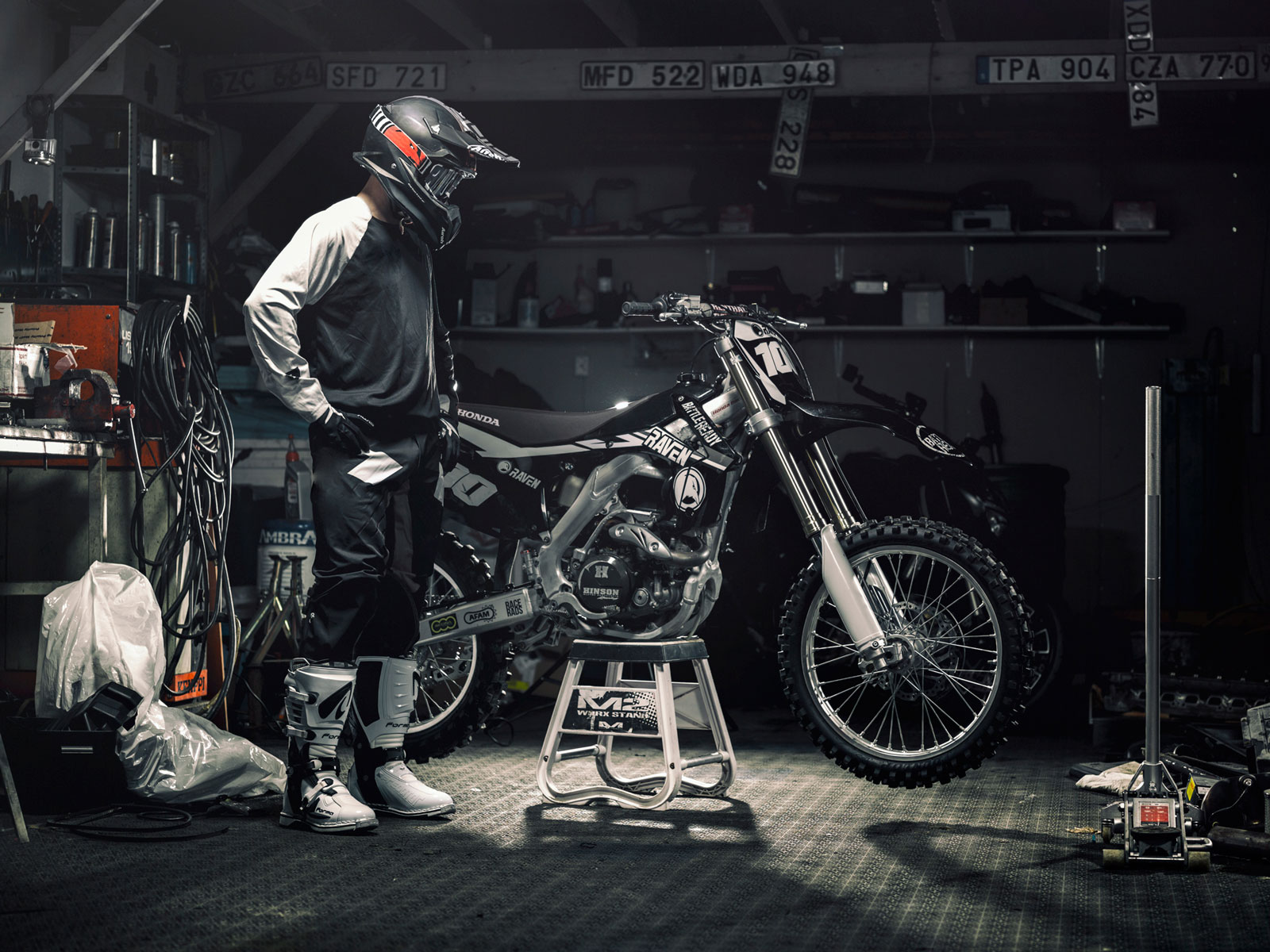
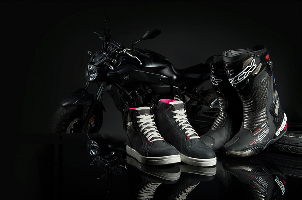
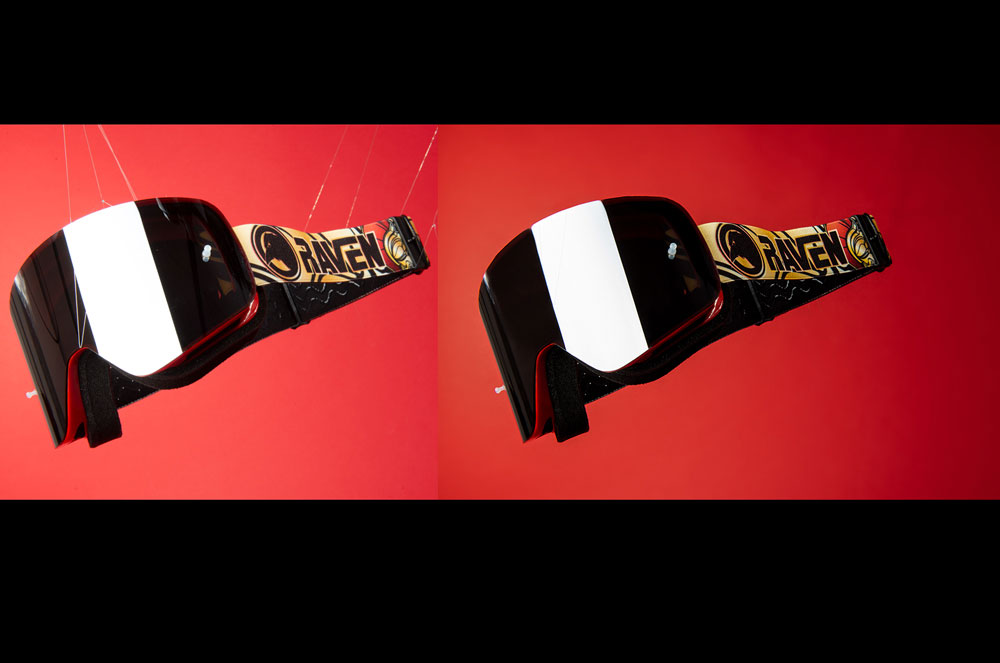
- I worked with the marketing/campaign department at Pierce A/B. My team was responsible for the UI of 39 online shops. Every year we provided about 6 big campaigns and lots of small ones. With every campaign, there was a new concept of website layout and photoshoot session. Next, we created online banners, newsletters, and social media. We strictly cooperated with campaign planners and photo studios on a daily basis. We used Adtech/Martech marketing technology to run campaigns. In addition, I worked closely with a dozen country managers across Europe. I managed, collected, and fulfilled design requests for their projects. Builded concept layouts for 3rd party websites, supervised photo sessions, designed print materials, and social media. Consulting, branding, and product advertising strategy was my everyday responsibility. Managed everything from start to finish, including last-minute changes. Developed and optimized request processes for country managers to improve quality and reduce production time.
- Product design
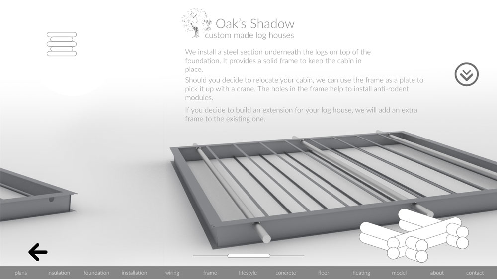
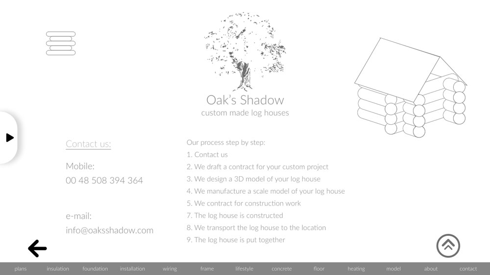
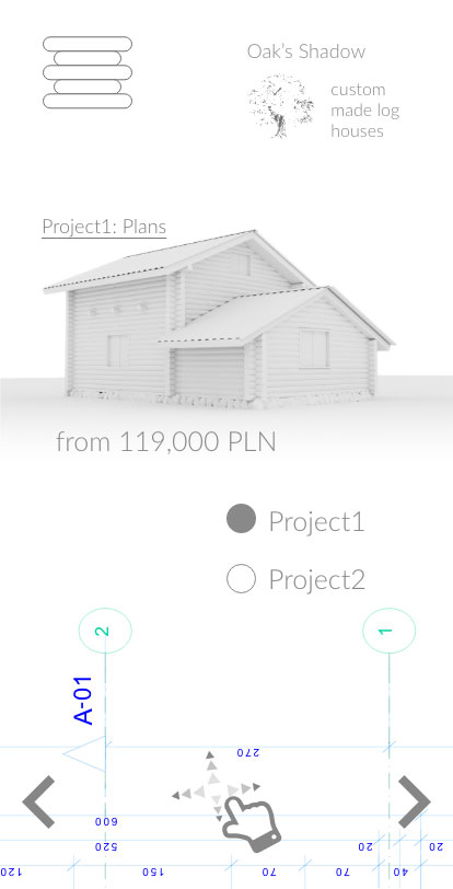
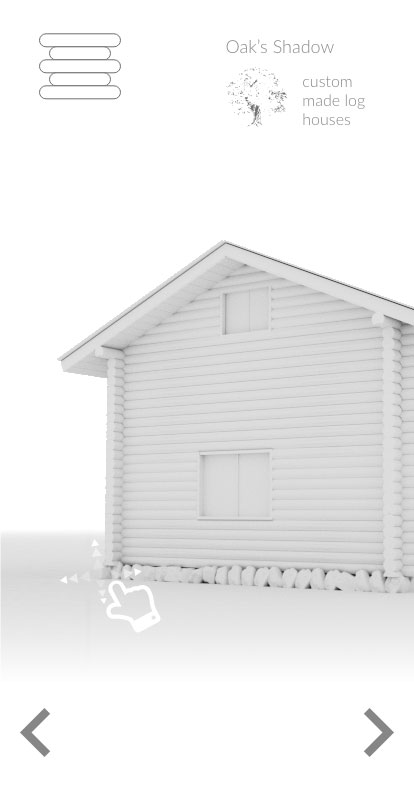
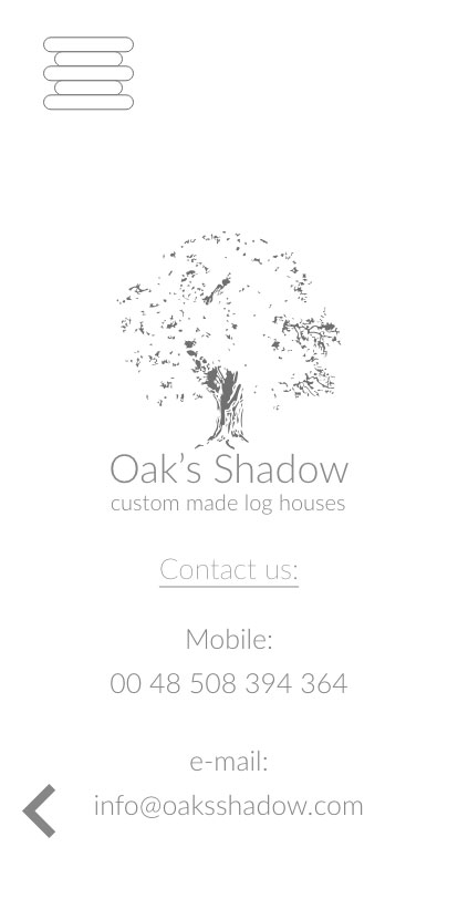
- I made this product for a log house manufacturer. I created profile of the persona, wireframing and all assets for desktop and mobile prototype. I prepared description of the brand story and logo.
- Yachts Manufacturer
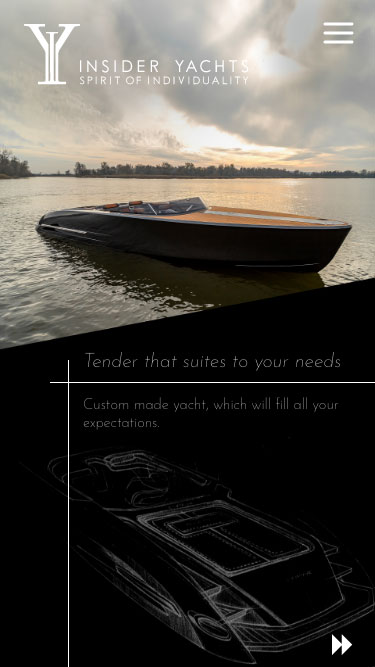
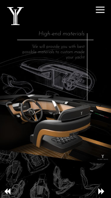
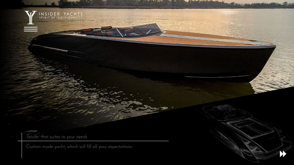
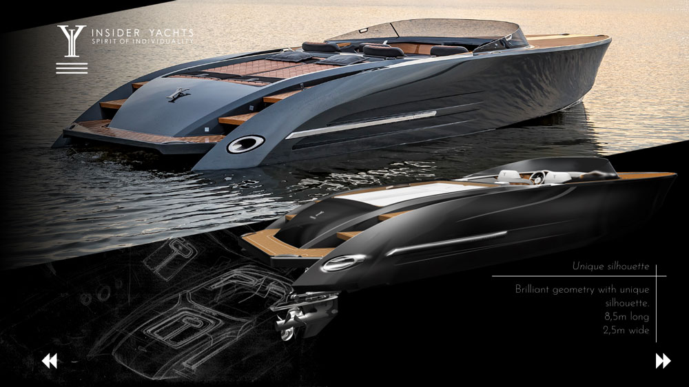
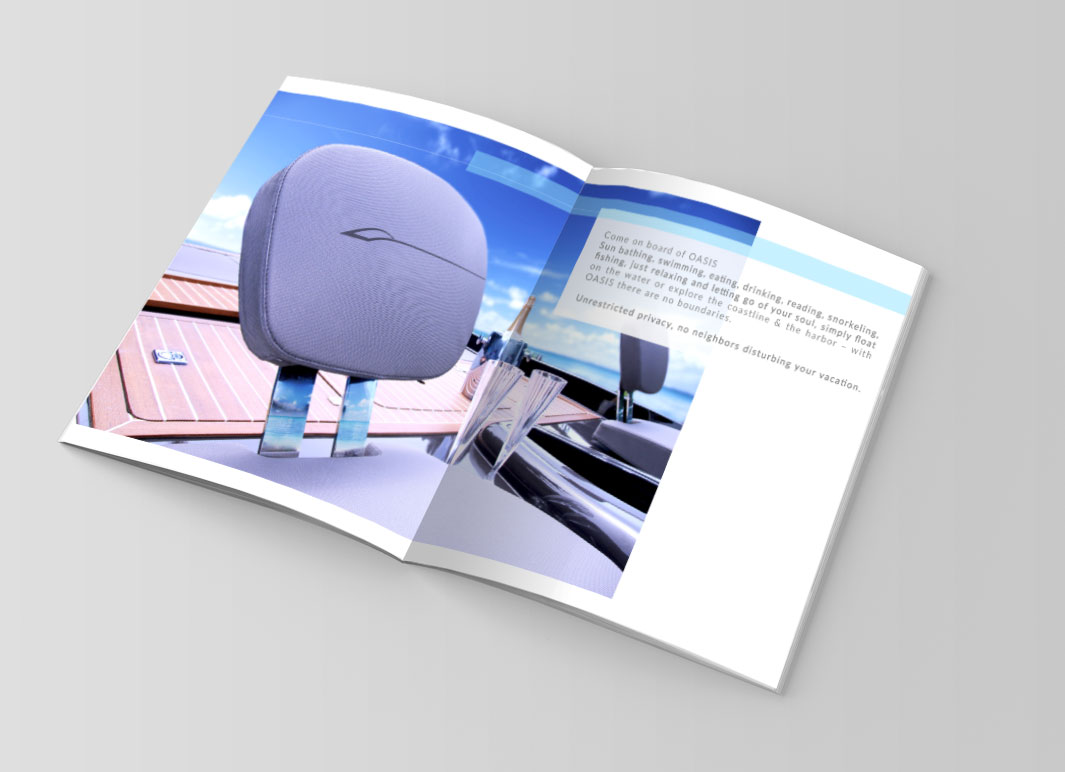
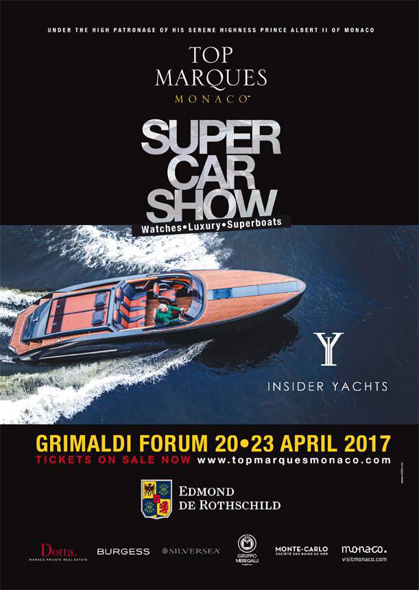
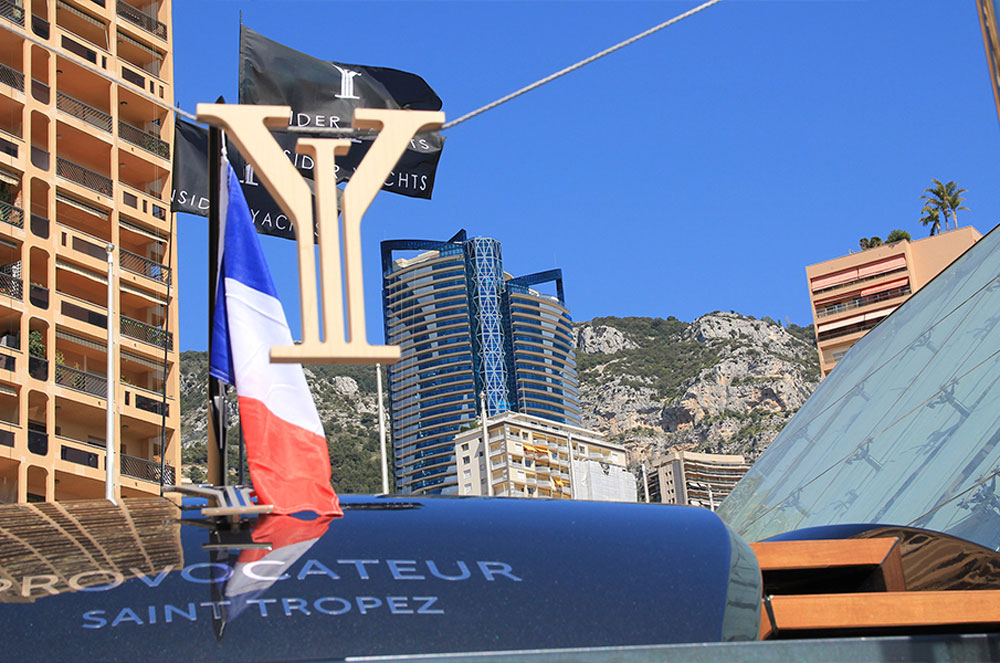
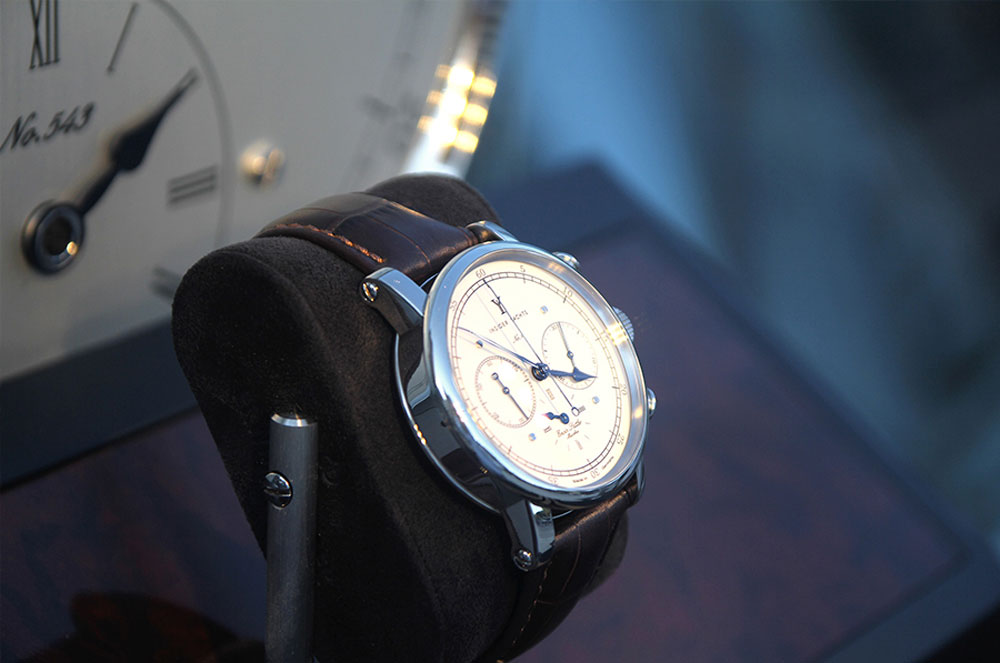
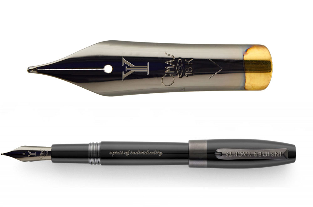
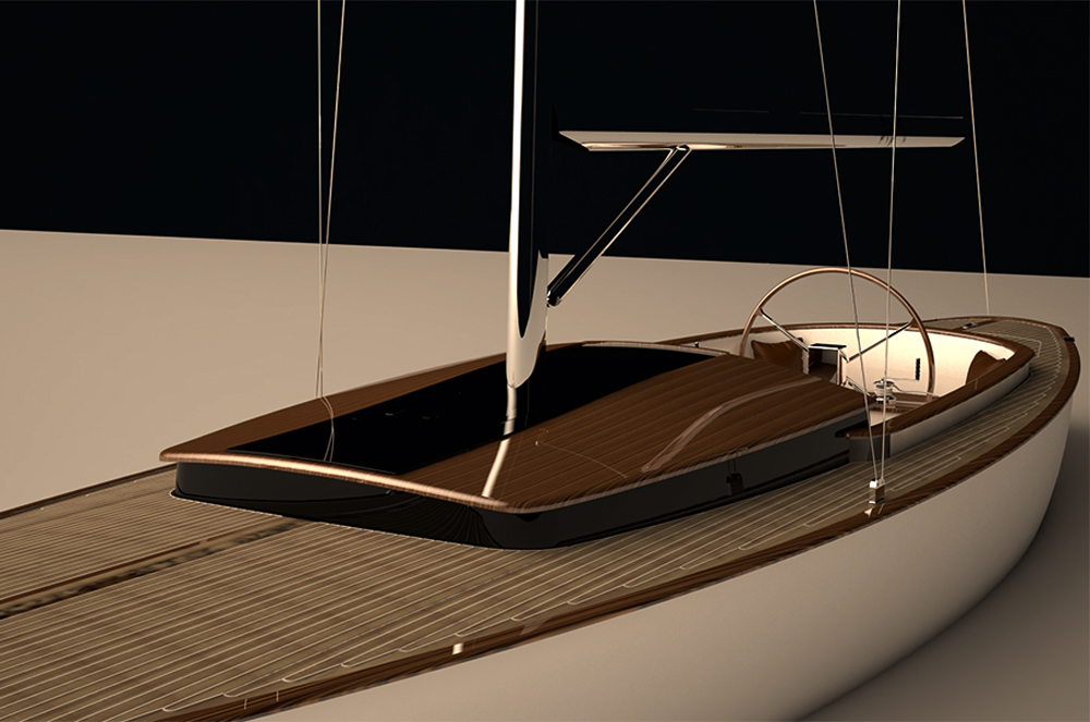
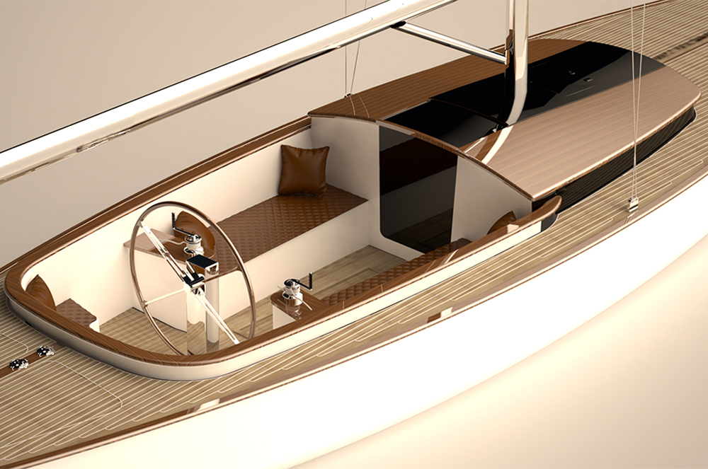
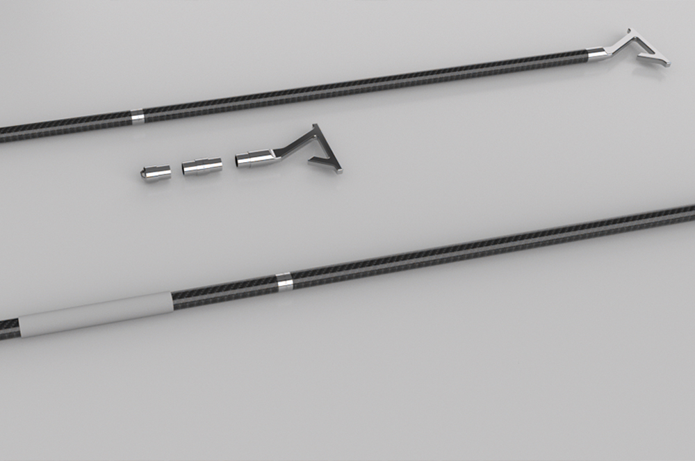
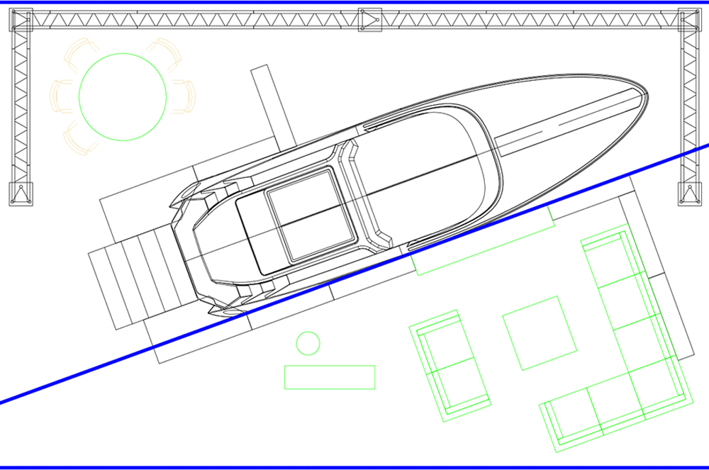
- While working for Insider Yachts GmbH in the marketing department, I had a wide range of responsibilities, including but not limited to designing the website UI. In this case, we had decided to use WordPress CMS. Part of my job was to create custom designs for close partners and clients to ensure brand and products continuity across all retail touchpoints. Additionally, I was a supervisor of photo sessions and expo displays in Dusseldorf, Germany, and Monte Carlo, Monaco. All graphics and website administration were made by me with Adobe CC and Rhino 3D. Working closely with content writers, website managers and video producers. Preparing, finalizing, and releasing products to market. Full responsibility from logistics to marketing efforts including media production, post-processing marketing materials and planning next milestones for future releases.
Direct
link to mobile prototype
Direct
link to desktop prototype
Direct
link to UI concepts
Virtual 3D presentation of Insider yachts
made with "Cl3ver" software


